The montage that currently heads my blog is built up from four layers each containing an image (PicA.jpg, PicB.jpg, PicC.jpg, PicD.jpg - in sequence below) and two further layers each containing text (Works Well, and the opening of the sonnet). Let's deal with the images first.
 1. Open all four images together in Photoshop.Although the biggest image (PicA.jpg - the Spitfire) will obscure the rest the others can be accessed by scrolling the little arrowheads at the bottom of the work area labelled Photo Bin.
The biggest image, PicA, is naturally going to provide the background to the rest. The others I'll call subsidiary images. For the moment, simply bear this in mind.
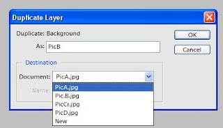 2. Using the Photo Bin arrowheads open (ie, bring to the top of the pile) any of the three subsidiary images. Let's say this is PicB. Go to Layer in the toolbar and click "Duplicate Layer". This small window (above) has two slots that need to be filled in: "As:" and "Document:" The Document slot has a downward-pointing arrow on the right which releases a drop-down showing the names of all four images.
4. Ignore the data shown in the two slots. From the drop-down click on PicA which then appears in the "Destination:" slot and establishes PicA on the background layer. Up above, in the "As:" slot, type in Pic.B. Click OK.
5 Do Step 4 for the second subsidiary image. Using the Photo Bin arrowhead open PicC. Do Layer > Duplicate Layer; use the drop-down to again select PicA in the "Destination:" slot, then type in PicC in the "As:" slot.Click OK
6. Do the same for PicD.
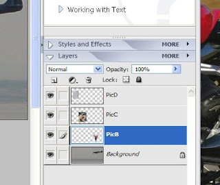 7. The three subsidiary images are now layered on the background image. You can confirm this by using the Photo Bin arrowheads to bring PicA to the top of the pile. The three subsidiary images may be piled one on top of the other. To shuffle them about independently identify the Layers facility at the bottom of the right-hand corner of the screen. Click on this and small versions of the four layers appear (see above), correctly identified. Click on any of them and a dotted frame will appear round the selected image.
8. The image may be moved around by locking the cursor on to the image's centre mark and moving the mouse. To resize the image click on its bottom right-hand corner. This causes the toolbar immediately above the work area to change. Click on the three-link chain to the right of the Width slot. This locks the width/height ratio and by pulling or pushing on the image's corner the size may be altered without distortion.
TEXT LAYERS
9. Use the Layers facility (bottom r-h corner of screen) to click on the background layer containing PicA. Go to Layers in the toolbar, click New. This causes a box to open with a slot called "Name:" Type in Text1 and click OK.
10. The thing that baffles many! A totally INVISIBLE layer has now been imposed over the four layered images. However its existence may be confirmed in miniature in the Layers facility. Using the Text tool (a capital T) in the vertical toolbar and choosing a contrasting colour write in whatever you want. Increase the type size in the conventional text box in the toolbar. Move the words round by using the Move Tool (top of the vertical toolbar).
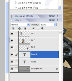
11. To create another text layer merely repeat Steps 9 and 10 but enter Text2 instead of Text1. The unshaped montage will look like the picture below and will be identified in the Layer facility as in the picture below that.
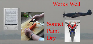
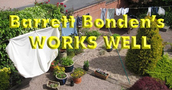
 12. Size, colour and font of the text layer are changed in the conventional manner. However Photoshop offers some sexier options. Works Well is an embossed special effect and is found (after some searching) under Filters.
13. When you're satisfied with the sizes and positions of the layered elements go to Save As, give it a name and feel superior to the rest of the known western world.
Novel progress 10/11/09 (Working title: The damaged con-rod). Chapter one: 3420 words, Chapter two: 3806 words. Chapter three (finished and edited): 3153 words. Chapter 3.5 (an interlude - finished 10/11/09): 500 words. Comments: Ch. 3 re-edited. Interlude (possibly in itals) links parallel story starting Ch. 4.

14 comments:
Way cool, BB! That's a pretty good (more easily understood) tutorial. I'll try this.
:)
Nice tutorial! Tutorial 2 - layers and masks combined with the gradiant tool?
I plan to hang on to this clear tutorial of yours, BB. If indeed 2010 turns out to be the year a computer falls into my lap, I'll be not only textually but also graphically active in short order. Looks less challenging than I've been led to believe. Certainly easier than GIMP.
The Crow: It's far easier than the words suggest, honest.
Julia: Well, first I'll have to teach myself masks. Just had a look at in the invaluable "The Missing Manual" - only half a page of guidance. Could be within my intellectual grasp.
RW (sZ): When this post eventually gets archived I'll carry a link on my home page.
Oh, good for you, learning this! Makes it all so much more fun, doesn't it? We'll soon have a whole list of tutorials from you. Just curious, what version of PhotoShop are you using?
Layers have always defeated me. No more. I shall keep your lesson. Cool indeed.
M-L: Photoshop Elements 3 more suited to idiot savants than the full monty.
Plutarch: I hope you are able to try it, but at your leisure. If there are any defects or logical lacunae let me know and I'll amend the primer.
If you SAVE AS as a JPEG file so that it can be used in other applications you will not be able to make any layer adjustments afterwards. If you want to keep it with useable layers save it as a TIFF.
As you say, BB, it's easier to do than write down. A favourite on presentational skills courses was to get them to write a lesson plan on how to boil a kettle and make tea - it could run to two pages!
I use Paintshop Pro, myself and its layers facility manages all my simple needs.
Sir Hugh: There are also restrictions about text layers saved as Jpegs. My aim was to simplify the sequence of creating layers so that users can overcome the discouraging initial process. There are other tactical considerations that can be tacked on afterwards when they become much easier to understand.
I've a mind to take a permalink to this and keep it on my desktop. You are a deeply public-spirited man, BB.
So...when do we get to read Ch.3?
:D
Now you come up with the tutorial. I've had a version of Photoshop Elements loaded on the old computer for years and when they said "layer", I never knew what they were talking about. My new iMac has photo editing inn place in a very simple format. Wish I knew you sooner.
Great job, by the way, explaining. Not so much for the knowledge, but for the patience.
Peace.
Lucy: I will myself provide a link for the article on my home page once the post disappears into the archives.
The Crow: Coming, coming. I should add that anyone who wants it need only ask. Ego-centric as I am, I am not inclined to pass it out uninvited.
Spado: I felt the same as you did about layers but was finally plunged into them by my grandson. Having worked on Macs during my final three years in publshing I can imagine how much easier and more intuitive layers would be on a Mac. A mere matter of slding the layers about like playing cards I should think.
I'm especially grateful for your comment about the writing of this piece. Instruction like this demands an extremely rigorous approach and I hope someone tries out the steps and lets me know if I've made a booboo.
Post a Comment